Coming into the tenth year of Android, the Android smartphone market has now covered a vast majority of smartphones users around the world with their open source technology and all smartphones manufacturers can utilizes and modifies them to be better. With their recent celebration of 10 year birthday, let’s have a look on the earliest variant of Android 1 to the newest Android 9, side by side.
It’s time to dig out all your memories and nostalgia!
Android 1.0 (left) vs Android 9.0 (right)
Home Launcher
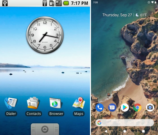
The first thing that everyone sees on a smartphone teaser disregarding the brand is the Home Launcher. It is the first glance to you love or hate. Both Android version shares the most iconic design and app arrangement with different level of details and colours, given that the newer Android 9 has improved drastically from the first few generations of Android in our hearts.
App Drawer
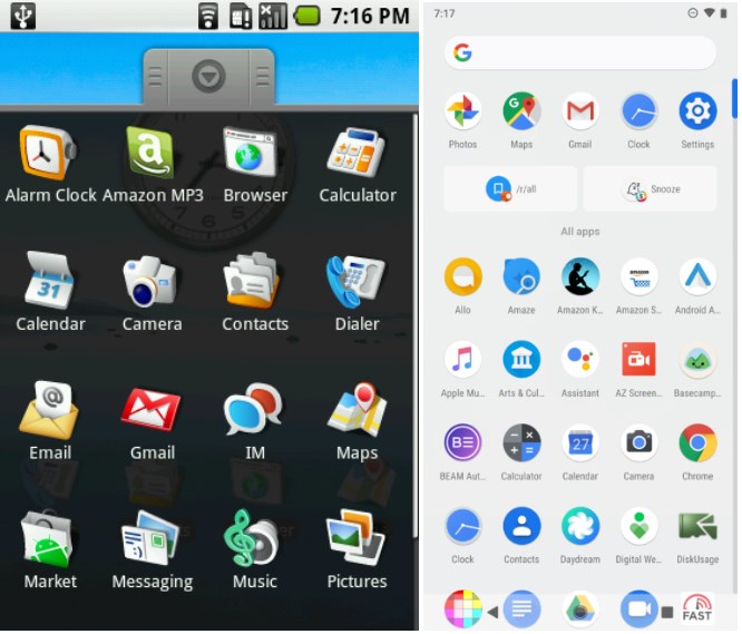
While there have been varieties of design on the app drawer, it has added a new selection and a choice that lies on user preference. While the icons on the earlier version might not be appealing, the touch of Material Design from Google that standardizes most icon has it appears better.
Even some Chinese smartphones no longer add in app drawer in their launcher as to mimic how iOS works.
Settings
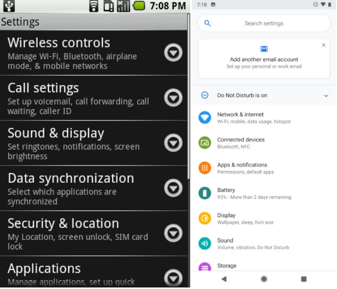
The first few generation of Android has opened up much more customization and settings to the end user where some users find it complicated to use. With the introduction of material design, words are now smaller followed by recognizable icons with vivid colours that catches your attention, making it easier to use.
Dialer
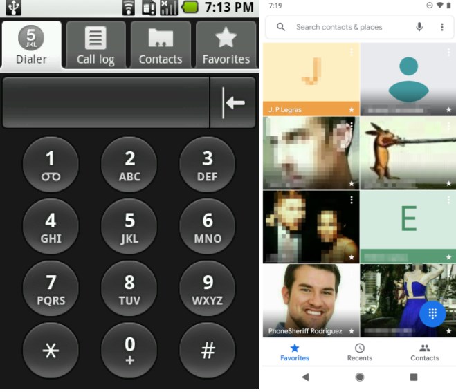
The good ol memories! With the biggest shift on the dialer design across devices, there are some tabs which are still present till today and being used by million and billions of people each and every seconds.
Browser
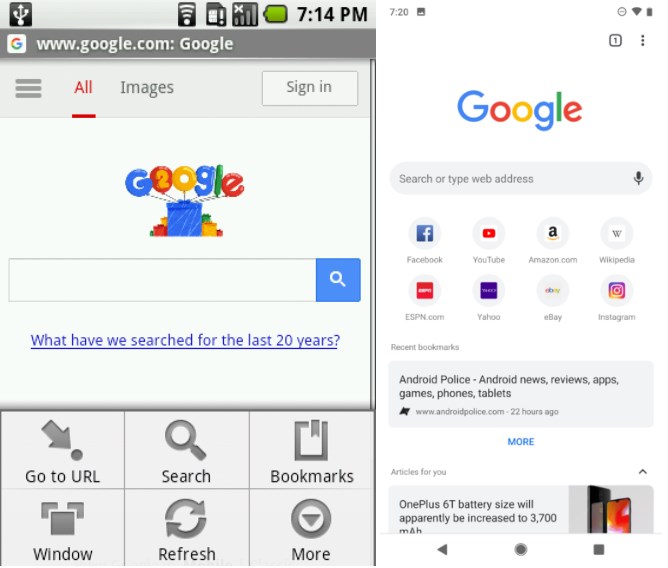
Digging into Google Chrome between both worlds, there has been a great paradigm shift onto the Chrome browser design for 2 different versions of Android. Newer variants are much more simplified and provides you with feeds so you can catch you with your favorite news on the go.
Gmail
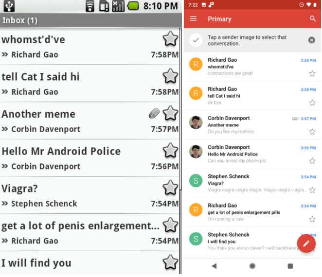
Instead of texts everywhere, Gmail design & functionality has since outperform older variants years and years ago. Everything is sorted according to threads and you can have a glance on the sender profile picture for instant recognition.
Oh hi there!
Calculator
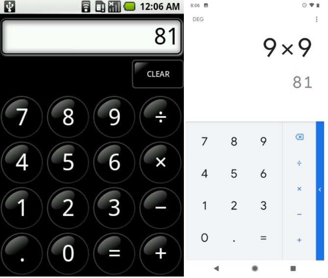
The simplest yet so essential app makes the calculator app a must have in all devices regarding of OS. Apart from the design change, the new calculator still do the same thing along with newer scientific function.
And by dividing zero you make the entire world cracked in pieces.
Diary
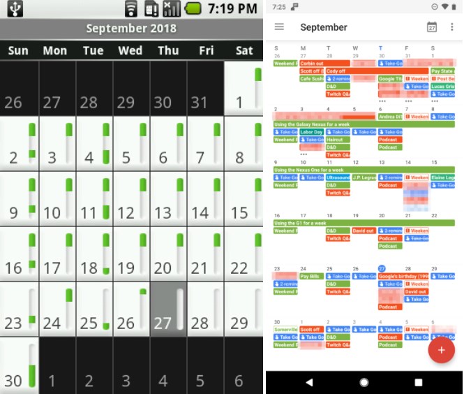
The most important tool to remind you what’s the most important thing today (ironic?)
Messages
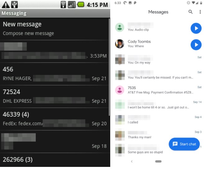
The new variant has a much more cleaner and better looking UI. Much is said.
Album
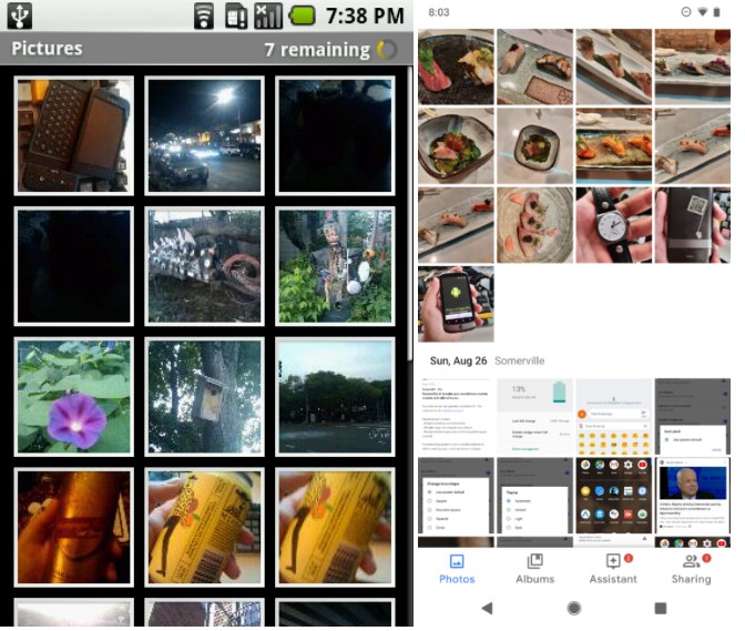
Instead of throwing your photos right into your face, the Google Photos integration classifies your image based on the date, location, person present in the image and other recognition criteria. It is now much more easier to search an image rather than flipping through your 1000 pieces of notes, documents and random selfies.
Music
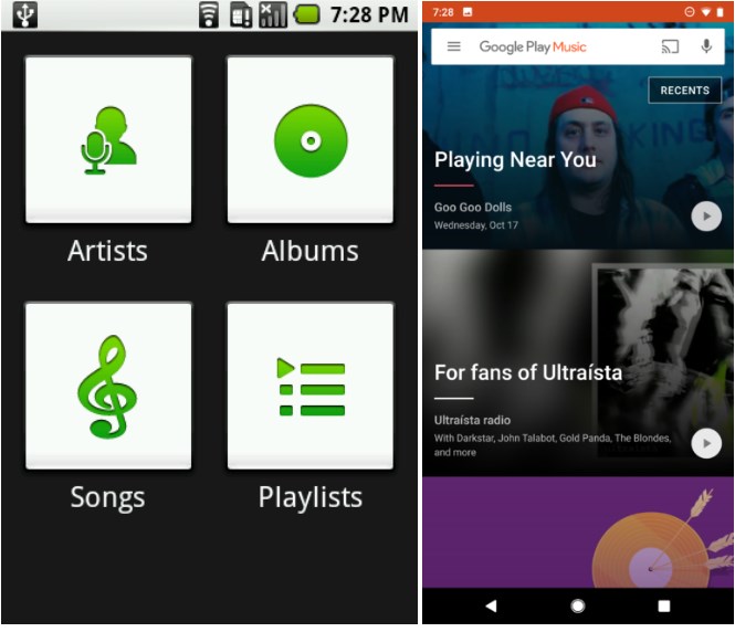
While both serve the same purpose, the new version with integration of Google Play Music makes online music experience possible without extra app. Not to mention that there are tons of music streaming apps and website available across the net.
Google Play
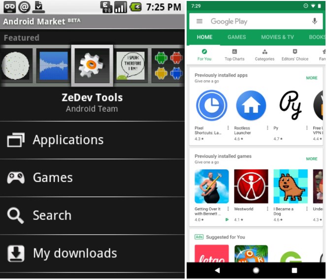
Instead of going through texts and texts, the Google Play UI is now covered in Material Design in clean manner. Apps and games are now easier to find with recommendations and suggestion and you can read reviews before you download and launch the app, realizing it is fake or full of ads.
Looking into all 10 years of change from the tears, blood and sweat from all Android developers, let’s give them our biggest applause for making smartphone friendly, more secure, more customizable and within reach of everyone.